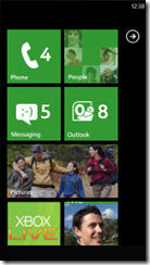
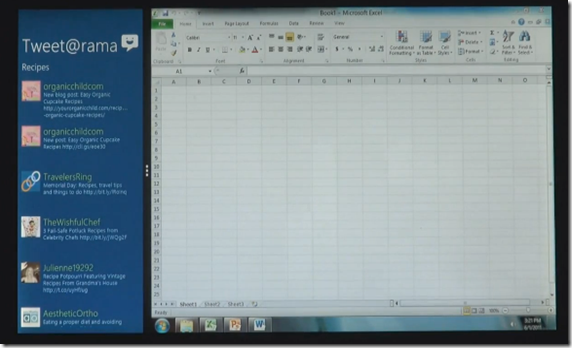
It doesn’t take a genius to instantly recognise that Windows 8 has taken some cues from its little brother Windows Phone 7, big colourful ‘live tiles’ and a very Metro looking interface make you wonder if Microsoft have gone too far. Are they going to alienate the core business and education markets by ‘dumbing down’ the OS in an effort to compete with a more and more tablet and touch centric marketplace.

Windows 8 & Windows Phone 7 – Similar much?
Details are still somewhat scarce, and while the video below demonstrates some of the capabilities such as new HTML 5 powered apps, app management and multitasking it also leaves so many more questions unanswered – though now the secret is out I’m sure these will now begin to trickle faster and faster.
Personally I think this is a very positive move for Microsoft. Microsoft is terrific at innovation and often has multiple developer teams working across different projects which then occasionally overlap and the end result has been market confusion and a lack of synergy.
With Windows 8 it is starting to feel like they are getting the band playing to the beat of the same drum, they’ve taken the ‘best of’ collections and started compiling it into one cohesive playlist, a bit of Windows Phone, and some Zune and some Media Centre, and some of our Live apps and even a touch of XBox 360 evident on the start screen with the current user profile showing in the top right corner.
Microsoft does need to make things bigger to suit both small and large screens alike, and more touch friendly to suit tablets however I was concerned that Windows was turning into a ‘feature’ OS instead of a ‘smart’ OS, was it really trying to reduce itself down the the Chrome OS level? That fear was relieved in the video below when they show a very Windows 7 looking interface running standard Office apps, almost as if Windows 7 is just an App within Windows 8 – and I’m OK with that.
I’m now a citizen of the cloud, I live in Hotmail and Facebook and Twitter so if Windows 8 simplifies my access to those things, yee haw! And for when I’m working and want my ‘traditional’ apps, knowing they are still accessible and can split screen with my new HTML5 life. I say bring it!
It does beg the question though…should it really still be called Windows?
Windows as a title has kind of made sense for the last 2 decades, because all your programs ran in…windows. Now that the OS is tile centric and revolves around full screen web apps and an overall interface that seems driven by the Metro design guidelines…is it any surprise that they are calling "Windows 8” the codename? Will Microsoft break from the old and start a new franchise for a new era? Can Microsoft break from calling their core platform Windows even if they want to? They certainly didn’t think so for their mobile phone OS.
What are your thoughts on the new OS? I’m pretty psyched and would happily beta test this baby if I could score a copy. Let us know your feelings in the comments!
Follow @tinmut


I don't like it, I'm afraid of change when it comes to something as fundamental as Windows. I like the fact that things I could do in Windows 98 I can still do now in Windows 7.
ReplyDeleteIt feels like they looked at Android and iOS and went "well if it works for phones and tablets we can make it work on PC's"
Also I know its still indev but what is with making everything straight edged boxes? After making windows all silky and smooth they have gone back to making it ugly.
I'll reserve further judgement for when more is announced.